Web Design: The First 100 Years

Maciej Cegłowski:

Our industry is in complete denial that the exponential sleigh ride is over. Please, we’ll do anything! Optical computing, quantum computers, whatever it takes. We’ll switch from silicon to whatever you want. Just don’t take our toys away.

But all this exponential growth has given us terrible habits. One of them is to discount the present.

When things are doubling, the only sane place to be is at the cutting edge. By definition, exponential growth means the thing that comes next will be equal in importance to everything that came before. So if you’re not working on the next big thing, you’re nothing.

I’ve been trapped here myself and only recently (within the past 2 years) was able to notice it. Realizing it is one thing. Breaking the habit is another.

Web Design: The First 100 Years

Jonathan Stark talks about the Entertainment Weekly Redesign:

When you are designing a responsive site, it’s best for all involved to get working prototypes in front of stakeholders early and often.

This seems so obviously true in my experience. Talking about a responsive implementation of a desktop design, or showing comps for various break points just doesn’t work. You need to get it in peoples hands so they can see how things change and adapt on different screens and devices.

Source

Using LESS with CodeKit to compile multiple CSS files

For the past month or so I have been using LESS in combination with CodeKit to author my CSS.

LESS adds a lot features that CSS lacks. It also allows structuring CSS in ways that aren’t practical for a production website or application and I think it’s going to play a large role in the future of web design. CodeKit makes working with LESS a breeze. CodeKit is also compatible with Sass, Stylus, CoffeeScript and Haml (if you’re into that level of abstraction).

LESS and CodeKit for mobile-first, responsive web design

There are two main approaches to building mobile-first, responsive websites. One method is to use multiple linked stylesheets with media queries called directly in the markup. Another is to use a single stylesheet with multiple media queries within it. (Of course with both of these approaches you will need to use a polyfill for old versions of IE or provide a link to a separate IE stylesheet). I prefer the using a single stylesheet because I want to keep HTTP requests to a minimum so our websites are as fast as possible. The drawback to using such an approach is that you may end up having a rather large CSS file which can make editing and debugging more difficult than it needs to be.

Having your cake and eating it too – Compiling multiple LESS files into one with CodeKit

Let’s start by creating a default mobile stylesheet. Since I primarily work with WordPress, I call this file style.less, and keep it in a folder called “less”. If you’re using WordPress, you need to compile it to style.css in the main template directory, otherwise you can place these files wherever you would like.

From within this file, we can import some helper LESS files (also kept in the less directory) near the top of the document. After my requisite WordPress stylesheet header, I have something similar to the following:

@import 'mixins.less'; // Mixins to use in our other LESS files
@import 'normalize.less'; // A reset stylesheet

Mixins are basically predefined styles that you can drop in anywhere in your LESS file. If you’re often using vendor prefixed declarations, they will save you loads of time. Dmitry Fadeyev was nice enough to share his set of mixins, but you can easily make your own. Andy Clarke has also recently released a set of mixins as part of his 320 and Up HTML5 Boilerplate extension which I highly recommend checking out.

The normalize file is basically a CSS reset and you can read more about Normalize.css here. Basically these are files I’m not going to change often and don’t want to be part of my main CSS files. It’s also important to note that if you’re coding a WordPress site, you will need to use LESS rather than CSS as the file extension even if you’re not using any LESS code. This is because CodeKit imports these files above your WordPress stylesheet header which will break your theme. It’s still in beta, so this may be fixed in the future.

After you have your helper LESS files imported, you can begin coding your mobile-first style after these @import calls. When your site is looking good on mobile and you’re ready to work your way up, simply import your media queries like so:

@import url("480.less");
@import url("600.less");
@import url("768.less");
@import url("992.less");
@import url("1382.less");
@import url("2x.less");

From within each LESS file, make your media query calls. In the 480.less file, you would want to put the following to target browsers with a minimum width of 480 pixels :

@media only screen and (min-width: 480px) {
body {
// Put your styles for the body element here
}
} /* end 480 */

Now every time you save a LESS file, CodeKit will compile it all into one CSS file. You now have the flexibility of authoring multiple CSS (LESS) files while serving just one CSS file to your server.
Hiding the iPhone URL bar

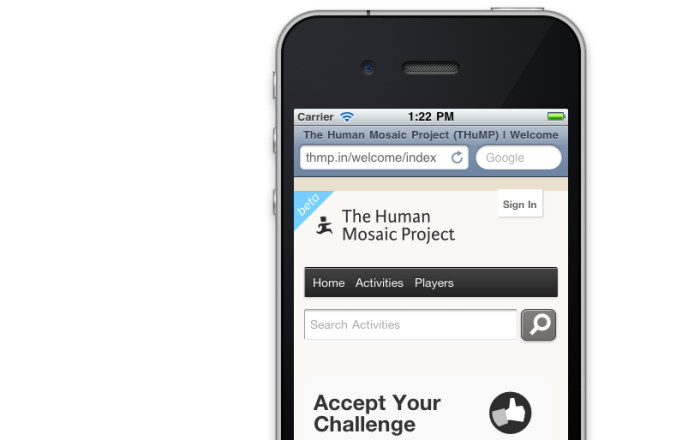
It’s a common practice to hide the URL bar for iOS and android devices. The reason for this is pretty straight forward: it takes up screen real estate.

An iPhone with the URL bar visible.

This is one very common approach that’s being used now:

addEventListener("load", function() { setTimeout(hideURLbar, 0); }, false);
  function hideURLbar(){
  window.scrollTo(0,1);
}

The above javascript simply scrolls the page to the top and in the process the iOS URL bar is scrolled off of the screen after the page loads. This works great, but it has a big usability problem that I ran into this weekend after some mobile web browsing over 2g. Namely, if you’ve loaded up a page that uses this function, and you then begin scrolling down the page to read or browse through the loaded content, you’re abruptly taken back to the top of the page when the function fires.

I’ve noticed this behavior on sites like TechCrunch and engadget, and it’s really annoying. I’m guilty myself of adding this code to websites myself, but will be avoiding it in the future. This isn’t something you would need to worry about if you load all of the content after the JS executes, but unfortunately that’s generally not the quickest way to load the page. I’d be interested in hearing any solutions to this problem, but for now I’ll just have to be content with a URL bar.

Basic SEO for WordPress theme developers

Generally the last thing people think about when building a WordPress theme is search optimization.

Features and design come first, and search optimization generally comes last or not at all. This article will discuss a few easy steps to make your WordPress theme a little friendlier to search engines. More specifically I’ll concentrated on explaining why it’s a good idea to optimize your WordPress theme, what the key elements of good on page SEO are, and discuss today’s best practices for on page SEO when designing websites that use WordPress as a CMS.

Continue reading “Basic SEO for WordPress theme developers”

Redesign Summer 2009

If you’ve visited here before you might notice that this site has just received a major overhaul. One of my main goals with this design was to improve the navigation and make it easier for people to access and find content. I also wanted to make it easier for people to get in touch, request proposals, and provide a better explanation of how our web design process works. I’ll discuss the motivations behind this design, the process, and some of the sites new features.

Continue reading “Redesign Summer 2009”

Sugar Labs Activities

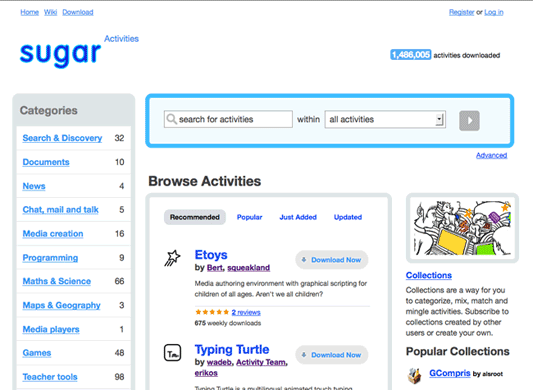
We’re designing the activities download portal for Sugar Labs.

This is a fork of Mozilla’s open-source web application, AMO (which is short for addons.mozilla.org) which they built as an add-on manager for Firefox and Thunderbird. The Sugar Labs team has forked this project to manage activity downloads for the XO laptop.

We actually finished this the design and front-end development for this project back in June. However, shortly after its launch Mozilla released a significant redesign of their AMO app which has a lot of cool features that we’re now working on incorporating for Sugar Activites.

We’re designing this site in-browser, so here’s a preview of what it will look like soon.

sugar labs website design project

UPDATE: Now online at http://activities.sugarlabs.org/ and 9,676,899 activities have been downloaded from the services as of 10/26/2013.

Motivation for a new design

Our website is just fine how it is, but I wanted to make information for potential clients easier to access and quickly scan.

On the most basic level, I really just wanted to reorganize our about page and add our design and development process in a four column grid below our elevator pitch. The idea was that this four column grid would sit below the a three column grid (the same grid as the current homepage) with some relevant information about Tucson Labs and our services.

Continue reading “Motivation for a new design”

Nikko Icons Beta Release

After countless hours of design work, I’m proud to release the first beta version of the Nikko Icon set. I’m also releasing a completely free “web edition” that contains 99 high quality icons. These web edition icons were create for people that don’t use Gnome but would like to use the icons for other purposes. The downside to the web edition is that it’s an incomplete set (it only contains icons that are 48 pixels in width and height). However, if you want all of the icons, they’re included in the Gnome edition – you just have to dig.

The changes for this release include:

  • # New navigation icons
  • # Most icons are now using the Tango color palette
  • # A lot of new application Icons
  • # New mimetypes

Get more info and download it here.

Creating Patterns in Inkscape

Patterns are an essential resource for web designers. They help dictate the character of a website and when used correctly can help shift the readers attention to desired sections on the page or help set the mood for reading.

The web is awash with resources free or paid pattern resources, but knowing how to create your own can often provide better results than an off the shelf, generic solution. Moreover you needn’t worry about downloading the pattern in the desired format or spending time searching through hundreds of images.

This article is aimed at explaining how to create a background pattern using Inkscape. Given that there’s a current trend on the web to use a repeating pin stripe pattern set at a 45 degree angle for a background image – I will use this as an example for the method. More specifically this tutorial will explain how to convert vector objects in Inkscape into patterns that you can use in your design. I’ll and also provide a work around for a fairly annoying pattern gap bug that affects Inkscape .47 and below.

Continue reading “Creating Patterns in Inkscape”

Redesign

I’ll be returning to Tucson in less than two months and had some time to give the Tucsonlabs a clean redesign.

For this particular design, I chose to use a much wider layout than I previously used. I also made it both a fixed-width three column layout and a fixed-width two column for a few pages. I completely redesigned the structure of the homepage, design page, contact page, and articles page. For the articles and about pages, I chose to use a two column layout that was fairly similar to the previous design. I updated the logo slightly, and I ditched the adobe house (the lab) in favor of the lone saguaro. I still have a lot of little things I’d like to implement, but I thought I better get out what I had now and make small additions down the road. I’d say it’s about 95% complete. Please let me know if you find any bugs or have any suggestions.

Designing professional websites with Linux

Most web design companies and professionals do the majority of their work using either Windows or OS X. The primary reason for this, I argue, is that the industry standard tools such as Adobe Photoshop, Illustrator, and Fireworks only run (natively) on these platforms. For many professionals using Linux as a primary platform for creating websites just isn’t even considered. Nevertheless, using open-source tools on Linux to design and develop websites is becoming more popular for many different reasons. In this article I’ll take a look at why Linux and it’s open-source programs are gaining steam, as well as address some of the challenges designers face when creating and designing websites with Linux in a professional environment.

Continue reading “Designing professional websites with Linux”