One of the essential techniques in bringing technology to market is simplification. Dumb things down. It’s super important.
Via Ben Evans
Michael Riethmuller:
It appears that by using calc() and vw we can get responsive typography that scales perfectly between specific pixel values within a specific viewport range. This means you can have perfect smooth scaling between any 2 font sizes over any viewport range. The font will start scaling and stop scaling exactly where you want.
Incredibly useful.
(Via Chris Coyier)
When you are designing a responsive site, it’s best for all involved to get working prototypes in front of stakeholders early and often.
This seems so obviously true in my experience. Talking about a responsive implementation of a desktop design, or showing comps for various break points just doesn’t work. You need to get it in peoples hands so they can see how things change and adapt on different screens and devices.
The bottom line: don’t.
For the past month or so I have been using LESS in combination with CodeKit to author my CSS.
LESS adds a lot features that CSS lacks. It also allows structuring CSS in ways that aren’t practical for a production website or application and I think it’s going to play a large role in the future of web design. CodeKit makes working with LESS a breeze. CodeKit is also compatible with Sass, Stylus, CoffeeScript and Haml (if you’re into that level of abstraction).
There are two main approaches to building mobile-first, responsive websites. One method is to use multiple linked stylesheets with media queries called directly in the markup. Another is to use a single stylesheet with multiple media queries within it. (Of course with both of these approaches you will need to use a polyfill for old versions of IE or provide a link to a separate IE stylesheet). I prefer the using a single stylesheet because I want to keep HTTP requests to a minimum so our websites are as fast as possible. The drawback to using such an approach is that you may end up having a rather large CSS file which can make editing and debugging more difficult than it needs to be.
Let’s start by creating a default mobile stylesheet. Since I primarily work with WordPress, I call this file style.less, and keep it in a folder called “less”. If you’re using WordPress, you need to compile it to style.css in the main template directory, otherwise you can place these files wherever you would like.
From within this file, we can import some helper LESS files (also kept in the less directory) near the top of the document. After my requisite WordPress stylesheet header, I have something similar to the following:
@import 'mixins.less'; // Mixins to use in our other LESS files
@import 'normalize.less'; // A reset stylesheet
Mixins are basically predefined styles that you can drop in anywhere in your LESS file. If you’re often using vendor prefixed declarations, they will save you loads of time. Dmitry Fadeyev was nice enough to share his set of mixins, but you can easily make your own. Andy Clarke has also recently released a set of mixins as part of his 320 and Up HTML5 Boilerplate extension which I highly recommend checking out.
The normalize file is basically a CSS reset and you can read more about Normalize.css here. Basically these are files I’m not going to change often and don’t want to be part of my main CSS files. It’s also important to note that if you’re coding a WordPress site, you will need to use LESS rather than CSS as the file extension even if you’re not using any LESS code. This is because CodeKit imports these files above your WordPress stylesheet header which will break your theme. It’s still in beta, so this may be fixed in the future.
After you have your helper LESS files imported, you can begin coding your mobile-first style after these @import calls. When your site is looking good on mobile and you’re ready to work your way up, simply import your media queries like so:
@import url("480.less");
@import url("600.less");
@import url("768.less");
@import url("992.less");
@import url("1382.less");
@import url("2x.less");
From within each LESS file, make your media query calls. In the 480.less file, you would want to put the following to target browsers with a minimum width of 480 pixels :
@media only screen and (min-width: 480px) {
body {
// Put your styles for the body element here
}
} /* end 480 */
Now every time you save a LESS file, CodeKit will compile it all into one CSS file. You now have the flexibility of authoring multiple CSS (LESS) files while serving just one CSS file to your server.

This tutorial will focus on a new feature in Inkscape version .47 called spiro splines.
This is a simple technique and might be a bit of a stretch to consider as an actual tutorial. At any rate this is a fun tool with a lot of possible uses. Grab a copy of Inkscape if you don’t have one already and let’s get started.
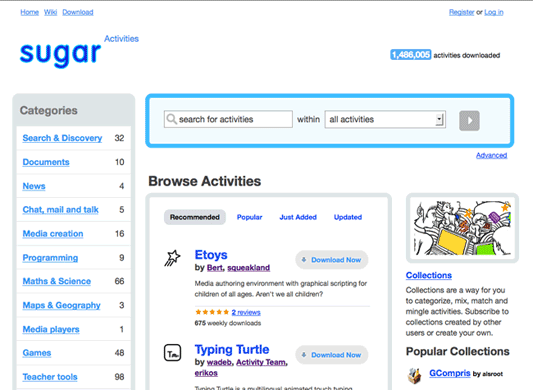
We’re designing the activities download portal for Sugar Labs.
This is a fork of Mozilla’s open-source web application, AMO (which is short for addons.mozilla.org) which they built as an add-on manager for Firefox and Thunderbird. The Sugar Labs team has forked this project to manage activity downloads for the XO laptop.
We actually finished this the design and front-end development for this project back in June. However, shortly after its launch Mozilla released a significant redesign of their AMO app which has a lot of cool features that we’re now working on incorporating for Sugar Activites.
We’re designing this site in-browser, so here’s a preview of what it will look like soon.

UPDATE: Now online at http://activities.sugarlabs.org/ and 9,676,899 activities have been downloaded from the services as of 10/26/2013.

This article will discuss a simple way of creating a star burst background image that is commonly seen throughout the web and in print media. Actually this effect is really being abused now days, but it definitely can look good when done right. This technique is fairly simple and quick, and you only really need to know how to use the pen (or bezier) tool.

With version 0.46, Inkscape released a new feature called “pattern along path”, which amounts to what you would call brushes in Adobe Illustrator. Although there are a few big differences in using brushes in Inkscape, it’s relatively easy to get the hang. I’ll walk you though how make and use brushes for your drawings.

Most web design companies and professionals do the majority of their work using either Windows or OS X. The primary reason for this, I argue, is that the industry standard tools such as Adobe Photoshop, Illustrator, and Fireworks only run (natively) on these platforms. For many professionals using Linux as a primary platform for creating websites just isn’t even considered. Nevertheless, using open-source tools on Linux to design and develop websites is becoming more popular for many different reasons. In this article I’ll take a look at why Linux and it’s open-source programs are gaining steam, as well as address some of the challenges designers face when creating and designing websites with Linux in a professional environment.
Continue reading “Designing professional websites with Linux”

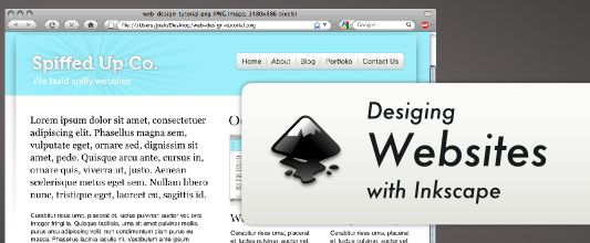
Inkscape is a great program to have in your toolbox as a web designer. It’s similar to Adobe Illustrator, but the user interface and tools are slightly different. It’s also an open source program released under the GPL, and is available for Windows, OS X, and Linux. This program can be used on on its own without the use of photo editing software like Photoshop or Gimp to create professional websites. This tutorial will walk you through some basic techniques for creating websites with Inkscape using this very basic blog design as a guide.