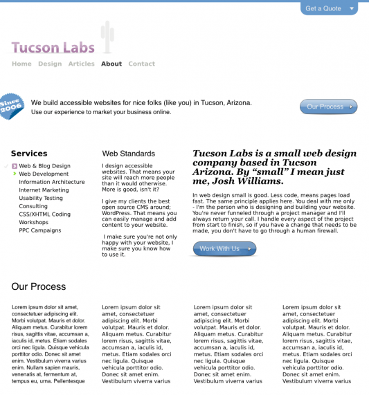
Our website is just fine how it is, but I wanted to make information for potential clients easier to access and quickly scan.
On the most basic level, I really just wanted to reorganize our about page and add our design and development process in a four column grid below our elevator pitch. The idea was that this four column grid would sit below the a three column grid (the same grid as the current homepage) with some relevant information about Tucson Labs and our services.

Using more white space
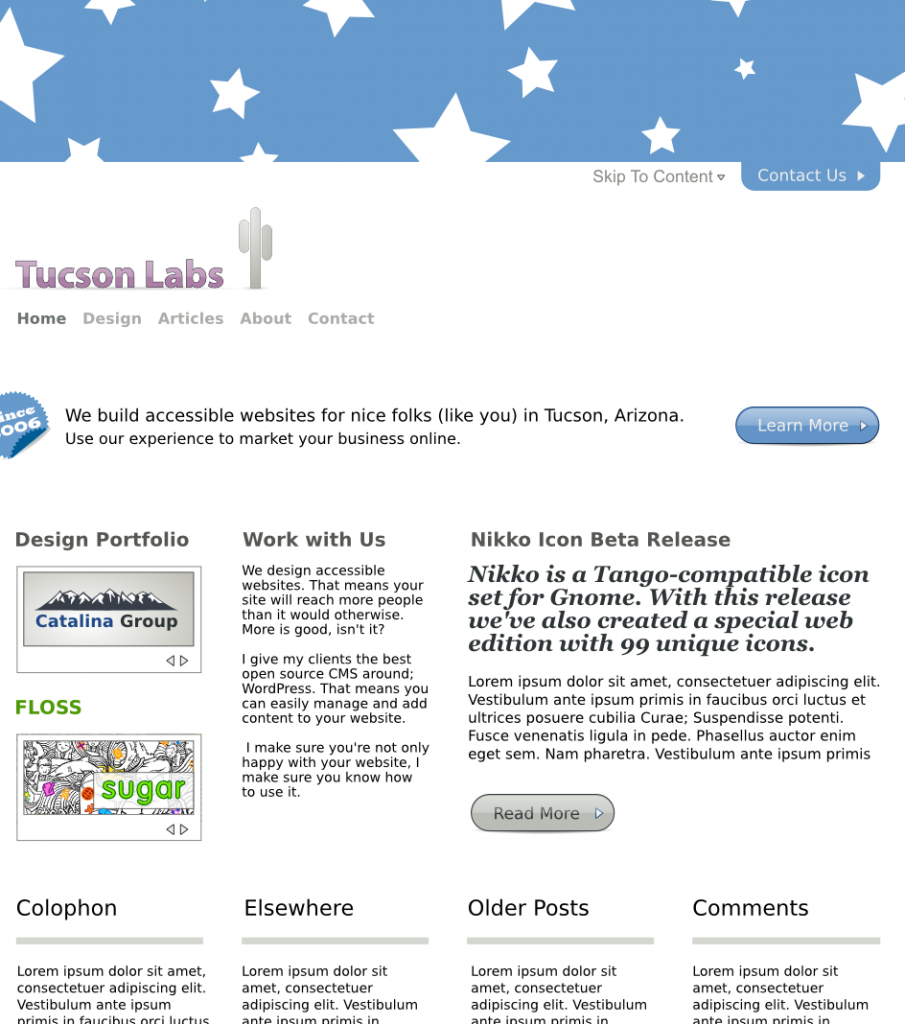
This new design uses more white space than the previousa me feel like I can breathe easier even though it lacks polish. Feeling good about this page, I thought I would take a stab at the home page.

The big blue header image with stars (yes stars) will probably be hidden only to be exposed when the contact us link is clicked. I haven’t made a decision about this yet. In fact I haven’t even decided if this new design will even get off the ground. Other changes include the portfolio and projects images which will likely be slides that people can skim through. I’ve also decided that summarizing a blog article will be helpful for people just scanning the site for information.
Thoughts and comments welcomed are appreciated.

Organization and nagivation is much better. But true maybe some more colour in header would be in my opinion not so bad.
Maybe you can start to post some videos or pictures and the website will be more colored :)
@Julia Thanks for your feedback! As you can probably tell I switched the navigation back to its previous location and stuck with an all white background.
@Ambyr I’ve actually been thinking about doing some screencasts. I just have to find the time.