If you’ve visited here before you might notice that this site has just received a major overhaul. One of my main goals with this design was to improve the navigation and make it easier for people to access and find content. I also wanted to make it easier for people to get in touch, request proposals, and provide a better explanation of how our web design process works. I’ll discuss the motivations behind this design, the process, and some of the sites new features.
The motivation behind the design
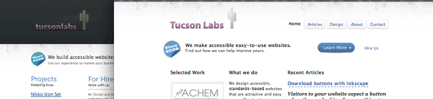
As I outlined in the previous post I started with the intention of just making some small adjustments to the about page, but this turned into a full overhaul of the site. I wanted to keep certain aspects of the site, like the layout of the home page, but I wanted to make big changes to the site’s typography. One of the other driving forces behind the design was too replace the images I was using for heading text throughout most of the site with just plain text.

While the previous headings looked nice, they were difficult to update. I had to fire up an image editor each time I wanted to change the text, and although I planned out ahead of time where these titles would be on the site, I inevitably wanted to change the titles and this just took up way too much time. I’ve always avoided using images for text replacement on client’s websites for just this reason, but I figured since I do all of the maintenance myself it wouldn’t be a problem. I was wrong about this, it wasn’t worth it.
One of the other problems with the previous design was how the portfolio was set up. I was displaying past work as thumbnail images that could be enlarged by clicking on them. This worked fine, but if people wanted to see a full size view of the site they were out of luck. I fixed this by adding each site as it’s own post and putting a large screen shot of each site on it’s own single post page.
The Process
I started out with a few basic wire frames to determine how the content would be arranged. I decided to keep the basic three column layout from the previous home page, but added a four column option for additional content and the footer.
When I finished the wire frames, I coded the site and started experimenting with different colors, design elements, and typography. I chose to go to with a not so flashy design and really tried to focus on typography. I ended up creating what I call a “faux baseline grid”. I call it this because it doesn’t really hold up over a more than a few paragraphs, but it works well for the home page and other pages viewed above the fold. I decided to go this route as opposed to using a true baseline grid because I wanted to use large font sizes for the article summaries on the home page and I felt that an actual baseline grid made the leading too tight.
Features
If you look under the articles category or a single article post, you’ll notice I added a search function. I thought this would be more useful than a banner explaining what we do because I think most people reading the blog already know what we do. It may or may not pass the ten second test, but I feel strongly that it’s better than what was up before, which was:
We build accessible websites for nice folks in Tucson, Arizona.
Use our experience to market your business online.
For the most part, people reading an article on the site wouldn’t gain anything from this, so for each category or page I added something different to that area explaining our services, or in the case of the articles category, I just put up that we write about web design, development, and open source.
I also added some small bits of CSS3 for the portfolio section. If you’re using Safari or Chrome, you’ll notice the image links fade to blue. Aside from those changes, I made it possible to browse through the articles and portfolio with out having to go back to parent page. A simple change, but I think it will make the site easier to navigate.
What’s next?
This site might see some small design changes in the near future and I’m toying with the idea of using @font-face to spice things up a bit. Otherwise I’m working on a new Inkscape article that I’ll probably publish after the next release (which should be soon hopefully) and I have a few different article ideas that I hope to start writing in the near future.