This tutorial will show you how to create a contemporary download button in Inkscape — a popular web design asset.
1. Set up your document
Open up a new document in Inkscape and then edit your document properties so your page is 150 pixels wide by 40 pixels tall. Feel free to choose different dimensions if this doesn’t fit your needs or you can use the default settings and just export the drawing (as opposed to the page) when you’re finished.

2. Draw a rectangle
Using the rectangle tool, draw a simple rectangle that extends to the edges of your document. You may find it helpful to turn on the grid by going to View » Grid or by pressing the # key. If you’re using version .47 you can also choose the snap to page border option in the snap control bar.

3. Create a rounded rectangle
Give the rectangle a 20 pixel radius. You can do this by either using the path tool and dragging the corner handle down or manually set the radius in the tool control box.

4. Create a glossy effect (optional)
This process can be done in a several different ways, so feel free to use a different method if you know of one. You may also want to skip this step completely if you don’t want a glossy button.
First select your button and duplicate it by pressing CTRL + D. Next you’ll want to transform the object into a path by pressing CTRL + SHIFT + C. Now you should see node handles on the object when you hover over it with the path tool. You’ll also notice that while this new object is selected it will say “path” on the bottom toolbar.

Using the path tool select the bottom two nodes (you can select multiple nodes by holding down the SHIFT key) and press DELETE.

This will give you a funny looking shape which we don’t want. To fix this you’ll want to hide and retract the bottom node handles by holding down the control key and clicking on them (they’re mall circles).

Now you’ll want to change the colors for the button and the gloss. For the main background I’m using a RGBA value of EEEEECFF and for the gloss I’m using FFFFFF65.

Now we’re going to give the gloss some depth by shrinking it by 2 pixels. Select it and adjust its dimensions to 148px wide by 118 high. When you’ve done this, you’ll want to adjust its location so its centered and leaves a 1 pixel gap on top.

5. Create a circle and add a download arrow
Using the ellipse tool draw a circle (hold down the control key to constrain the proportions). Move your circle to the right side of the button and adjust it’s position and size until you like how it looks. Lower the circle below the gloss by selecting the object and using the tools control bar or by pressing CTRL + PGDOWN.

Draw an arrow with the bezier (pen) tool or you can draw a straight line with the bezier tool and add an arrow to it as an end point (you can access this option from the stroke style tab under the fill and stroke dialog CTRL + SHIFT + F). Center your arrow.

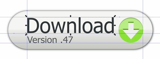
6. Add your text
You can add whatever text you’d like here. I chose “Version .47 – Ubuntu” for the final version.

7. Add a gradient to your button
I actually prefer a slight gradient to a glossy look, but if the design calls for a glossy look I almost always add a gradient to give it more of a three-dimensional appearance. To add the gradient select the button and bring up the fill and stroke dialog. Click on the edit link and then adjust each gradient stop accordingly. Next you’ll want to adjust the gradient handles so they are vertical like the screen shot below.

8. Add a subtle drop shadow
Duplicate your button (CTRL + D) and move the duplicate object to the bottom of the document (CTRL + PGDOWN). Make this object black and give it a blur setting of 2.0 (this option is under the fill and stroke dialog). Play around with the blur setting and adjust the position of the shadow for better results.

9. Export for the web.
Export your button by pressing CTRL + SHIFT + E. Then select page, choose where you want to save your file, and then click export.

That’s it. You’ll probably find the best results by making small adjustments throughout the process to suit your needs. If you used small text like I did for the version number and it appears blurry, then you may want to add the text with a bitmap editor such as Photoshop or Gimp. Small text sometimes looks poor in Inkscape because it doesn’t support font hinting. As a work around, just add you text with a bitmap editor.
Source File. To download, right-click and select save link as.
you didnt attach any stuff regarding to the page setup. directly you gone to creating button. how can we know to setup …?i am new to inkscape please help me frd
@Mano, I’ve added the document properties, but you actually don’t need to change any of those settings to make the button. How I would approach this in a real world setting is figure out what text I need to use for the button, and then create the page dimensions around that. I actually do this with a lot of my artwork that doesn’t need to fit specific dimensions. There’s actually a handy function that I use called Fit page to selection it’s located in the document properties dialog.
Thanks for reading!
Thank you Josh.
I am learning Inkscape and your tutorial is great.
In part 7, the gradient made the upper part of the page too bright.
I ended up duplicating the main button, cutting the new object to half and adding gradient only to this part.
How would you create the other 2 images in the css sprite – the one for hovering above the icon and the one for the click itself?
if you know of good links, It would be great as well.
Thanks again
Hi Oren,
If the gradient is too bright you need to adjust the stops in the fill and stroke dialog box. One way to create a sprite is to make a group of the whole button. You do this by selecting all the objects in the button and then press control + g. Then duplicate the group by pressing control + d. Move the duplicated group below your finished button.
At this point you would probably want to ungroup the object and change the gradient or background color of the button.
That isn’t a very detailed explanation, but it should be enough to get you going. The subject really needs its own post, and it’s something I’d like to do but I just don’t have time at the moment.
Thanks for reading!
You started out with a 140x40px canvas… continue talking about shrinking the gloss shape to 148×118… have a canvas of 150x40px in the screenshots. Kind of confusing at first because it’s hard to see where the radically different dimensions are coming from, but I after a few minutes I figures it must have been a mistake. Could you fix the little few discrepancies in the post or am I interpreting it all wrong?
I must say that you’re very observant, and produce a convincing argument. I just fixed the issue you pointed out, so now you can re-read it without those confusing mismatching document size numbers.