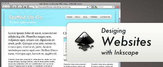
Inkscape is a great program to have in your toolbox as a web designer. It’s similar to Adobe Illustrator, but the user interface and tools are slightly different. It’s also an open source program released under the GPL, and is available for Windows, OS X, and Linux. This program can be used on on its own without the use of photo editing software like Photoshop or Gimp to create professional websites. This tutorial will walk you through some basic techniques for creating websites with Inkscape using this very basic blog design as a guide.
Document Set Up
Open up a new document in Inkscape and edit the document size by navigating to File » Document Properties or just press Ctrl + Shift + D. Then choose the dimension for your website, I’ll choose 960 pixels wide by 2000 pixels high, but you can choose whatever size you’d like.
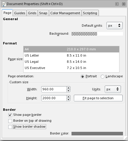
A width of 960 pixels is popular for web design because most people in the US have a computer with a resolution of 1280 by 800 or greater. However, the dimensions you choose totally depend on your target audience (which may not be the US). You may also want to consider making a special style sheet for the growing number of people accessing the web from their mobile phones.
The Layout
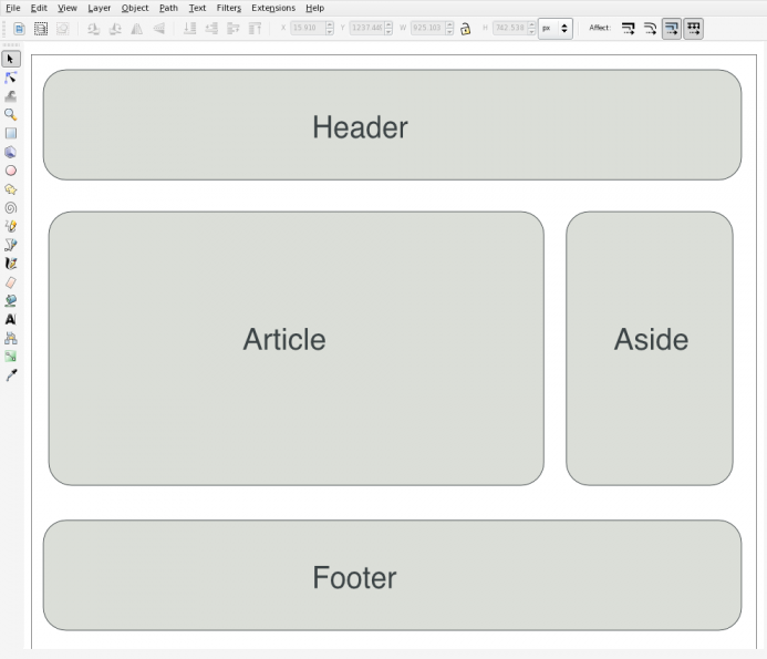
The next thing we need to think about is the site’s layout. I’m going with a fairly standard blog layout with a header section, an article section, a sidebar (which I’ll call “aside”) and a footer section. You’ll also notice that I didn’t include a navigation section. That’s because this site is a fairly simple blog and I just wanted to integrate the navigation into the sidebar.
Creating An Export Layer
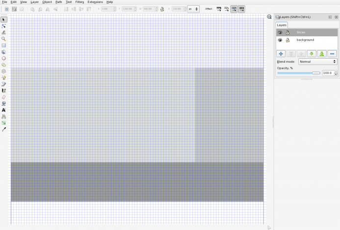
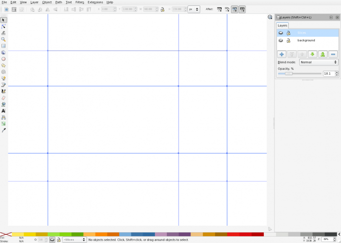
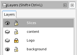
Since Inkscape doesn’t support a function like Photoshop’s ability to slice an image into multiple pieces, we will need to create an export layer. To do this press CTRL + SHIFT + N, and name your new layer “slices” or “export”. Then bring up the layers pallet if it’s not already by pressing CTRL + SHIFT + L. Click on your new layer and then using the rectangle tool create the sections of your website. You’ll want to make sure that your rectangles have no stroke applied and that they’re butted up to one another as well as your document’s border. To make this easier turn on your grid ( SHIFT +3 ) and make sure snap is enabled in your document preferences. You can actually do this after you design the site and you’re ready to export, but why not just get it out of the way? You can also save this as a template to start all of your website designs with.
Guides
Next you’ll want to select and copy all of the objects on this layer by pressing CTRL + A and then CTRL + C. Then turn these objects into guides by pressing SHIFT + G and then paste your export layer back in place by pressing CTRL + ALT + V. I like to use guides when designing, but it’s not a requirement by any means. You can turn guides on or off by pressing the pipe key “|”.
Design
I’m going to start with the header and I already have an idea for the colors. Using the rectangle tool draw a rectangle that fills your header.
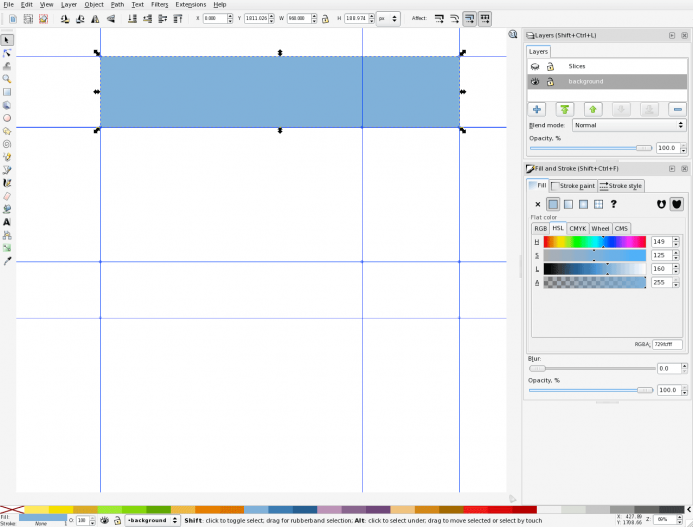
Then with your header rectangle selected open up the fill and stroke dialog box by pressing CTRL + SHIFT + F and select the radial gradient icon. Click edit and adjust your stops accordingly. I’ve chosen to use a light blue center that gently darkens at the edges.
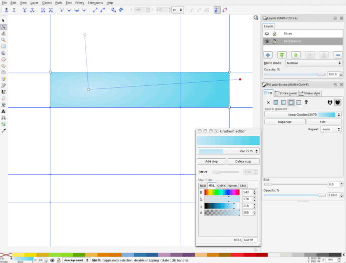
Duplicate your header background image by selecting it and pressing CTRL + D. Then make the width of this duplicate object 40 pixels smaller. You can do this quickly by turning on the grid using the # key and using the select tool. You may also want to create new guides to use later on, but it’s not necessary for this design.

The Drop Shadow
This next step will be to create the drop shadow, which you can do easily in version .47 of Inkscape using filters, but in .46 it’s a bit more involved so this quick and easy method will do. You’re going to duplicate the header yet again (yes again) and give it a fill of black and a blur of 3.0. Then move this document below the header you created prior to this one by pressing Page Down. This will give you the drop shadow that we’re after.

The body
Next up we’re going to create the body for our website. Duplicate your header just one more time (I promise this is the last time) and give it a fill of solid white. Then with the selection tool grab the top center arrow and drag it half way down the page. This way your body will be flush with the header. Now cycle through your objects using the tab key and select your drop shadow. With the drop shadow selected grab the bottom arrow and drag it until you can see it beneath you website’s body.
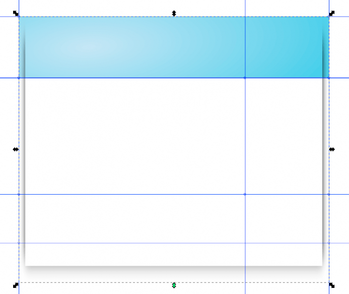
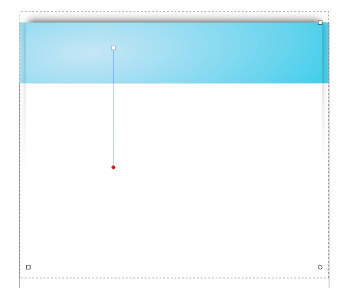
Now this is close, but not quite the effect that I’m looking for. To get it just right bring up the fill and stroke dialog and click on the linear gradient icon. Using the node tool (or the gradient tool) give the shadow a vertical gradient that fades out slightly below the header.
The logo
At this point you’re going to want to lock your background layer in place and create a new layer for your logo. A good name for this layer would be something like “logo” or branding. Now, I’m going to go over how to draw a logo, so you’ll either want to draw one on this layer or import your existing logo. To import an image press CTRL + I and navigate to your SVG or bitmap file. If you import a bitmap, select the object and then press CTRL + A to convert the object to a pattern. This will allow you to save the file without loosing the bitmap, and you can edit the image as an SVG object.

Main Content
Now the we can move into creating the main content section. I’m just going to be using plain text for the main content and headlines without any other background images besides the one’s we’ve already created. So, the following won’t actually be used in the creation of the site, but it’s just to give you an idea for how you want the typography set up or if you need to show a client how the site will look before coding it out.
To start lock your logo layer and then create a new layer named “content”. Then whip out the text tool and start typing. Fortunately Inkscape has a built in lorem ipsum function that will automatically input dummy text for you. This is an extremely useful function that can easily be accessed through Extensions » Text » Lorem Ipsum. Just choose your settings and press the generate button.
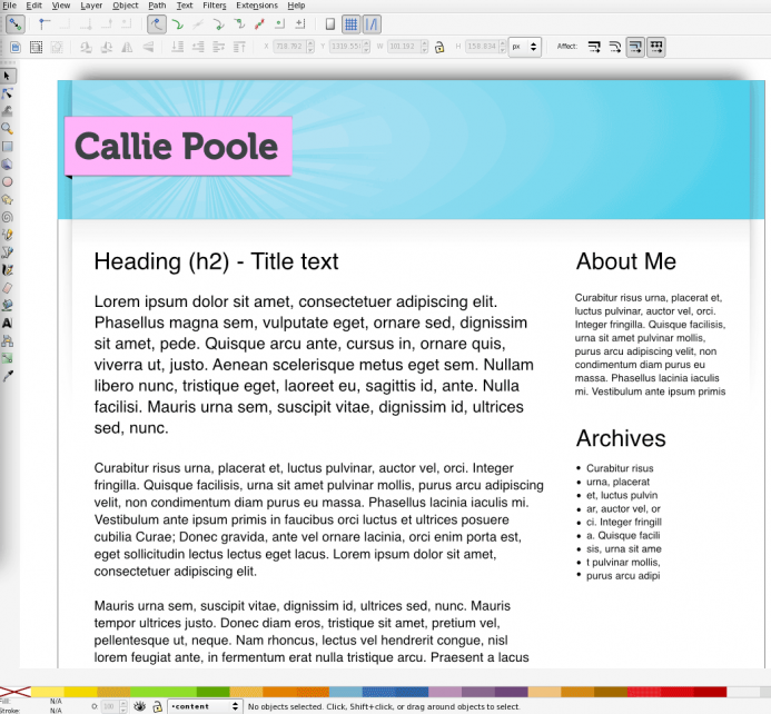
You should now have something looking like the image above. You might have notice I added a sun burst pattern to the header. If you want to read up on how to make that effect, I’ve written a tutorial about it here.
Finishing up – Batch Exports
All we have to do now is export our images. We’re going to start by exporting the background images, so you’ll want to hide all layers except the background and export layers.
Then you’re going to select the header export layer and bring up the export dialog by pressing CTRL + SHIFT + E. Next make sure the selection tab is pressed so that only the header is exported and then select where you’d like to export the image to. It’s a good idea to create an images folder to keep everything in one place. For this example though, I’m just going to be exporting to my desktop.
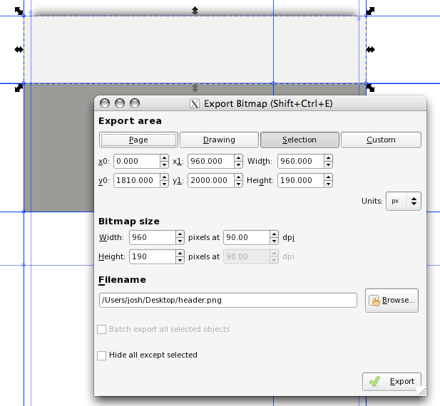
Repeat this step for the body.
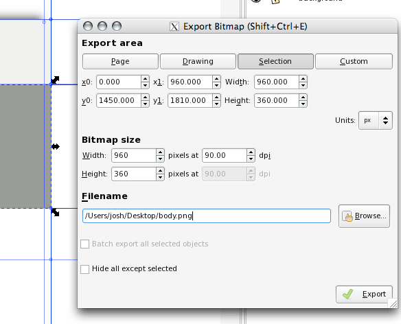
Now you’re going to select all (CTRL + A), and then hide the layer. With the objects still selected, bring up the export dialog and select batch export.
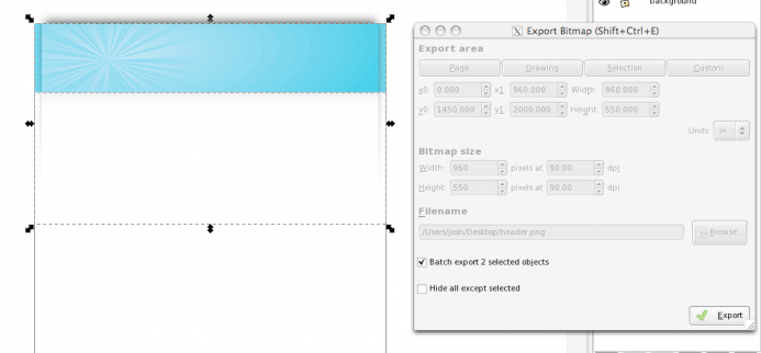
Now your header and main background will be exported. This should give you an idea for how the batch export tool works. And how you would build the rest You’ll need to create an export object for your logo as well.
The above Page is under construction!
Good tutorial, congratulations.
Question: Its lacking the exportation to HTML/CSS Explanation!
Im noob in WebDesign and would like to build a professional Website thats why im learning Webdesigning(Inkscape,GIMP) and Programation(html,php,css,mysql).
Email me if u can because dont know if i will check your post here as soon.
Best wishes.
Cool tutorial, but could also do with some more on exporting for web.
I really like the look of inkscape and would love to use it more for webdesign but I’m finding the export option is pretty limited. It only seems to do pngs and anything with curves just looks, well bad.
cheers
@Dansk
I’m glad you liked the tutorial, and I agree with you about the export process for the web. I’ve been meaning to touch this article up and do a better job of illustrating how you can use the batch export tool specifically for web design. If you’re interested in getting web-ready gifs, you should check out ImageMagick. It’s a powerful tool that can be used to convert png images to gifs, and you can install it on OS X, Linux, or Windows. When you get it installed, navigate to the folder where you’re exporting your png images and type:
mogrify -format gif *.png
This will quickly create gif images from your png files and deletes nothing in the process. As far as your problems with curves, I haven’t really noticed that. However, I have noticed the lack of support for font hinting, which would be really problematic for people using Inkscape as their only tool to create web page images.
Hi
How do you use the PNG exported to build a website?Is gif accepted by software like dreamweaver to build templates? i dont use dreamweaver but NVU and am a Newbie
Nice tutorial though
Superb tutorial, just what I was looking for!
thanks for putting this up together…was definitely helpful !
@Escloud
Building the website with the PNG images would be another tutorial in itself and is something that’s on my todo list. I don’t see why you wouldn’t be able to use PNG images with NVU or Dreamweaver. GIF is a bit larger than PNG and it doesn’t support alpha transparency so I usually use PNGs. If you want to convert your PNGs to GIFs I recommend using GIMP, Photoshop, or ImageMagic (the list could go on and on).
Nice tutorial,
I see it’s been around for a while, but very useful for those folks who are new to Inkscape and miss other applications’ abilty to export layers.
In the past I’ve used the Export Slice plugin (http://panela.blog-city.com/slicing_web_pages_with_inkscape_and_python.htm) which has worked a treat. It didn’t occur to me to try and just do a ‘select all’!
One thing that is omitted though: How do you cope with the issue of Inkscape using sub-pixel vectors to prevent lines and text blurring? I’ve read a few ways to manage this and just wondered what your take is.
I wasn’t aware of that export slice plugin, but it sounds nice. As for the blurring issue of the text there isn’t a solution to that and the developers aren’t planning to implement one as far as I know. However, if you want nice crisp borders for images all you need to do is make sure they’re lined up correctly before you export them. When you select an object or a path, take note of the width and height located on the tools control bar. These numbers should be whole if you have no stroke (i.e., Y = 3.000 and not Y = 3.324) and if you have a 1 pixel stroke they should be something like Y = 1.5 or 32.5.
Sorry, but I can´t get this to work.
Up to the point “The Drop Shadow” no real probs, but when it get´s to “The Body”, it doesn´t work for me. Call me stupid, but I tried several times and I can´t get it to work in the way intended. I´m an Inkscape Newbie. I used Corel Drawn 9 for several years and now I wanted to try Inkscape. Most of the shortcuts don´t work for me to. :(
Could you or somebody else please post an link to download the endresult as SVG?
It would be very nice and perhaps it helps me understanding Inkscape a little more.
Thanks and respect for your nice tutorials.
Thank you for this article. I especially liked the trick to select the crop area, then hide the layer, before (batch) exporting. I used to set the opacity to 0 for an area, export, set it back to normal etc.
I find png files exported by Inkscape quite *heavy*, compared to gif or jpg. So either I use a tool to optimize the png (pngcrush and/or optipng, both as a nautilus action), or a Nautilus script to convert png images to jpg (again with a right-click in Nautilus, no need to open gimp or a console).
Nautilus actions/extensions/scripts are *so* useful to speed up the work flow (another example: need to batch rename image files? Install Thunar and the corresponding Nautilus action.) One of the reasons why I like to work on Linux
(ps for Linux newbies: Nautilus is the default file manager in Linux Ubuntu.)
Greetings
Inkscape’s practice of exporting to PNG is smart for a few important reasons. There seems to be some confusion about PNG and whether or not it can be used directly for websites. Here’s a few of the comments that caught my eye:
1 I’m finding the export option is pretty limited. It only seems to do pngs and anything with curves just looks, well bad.
2 How do you use the PNG exported to build a website?
3 GIF is a bit larger than PNG and it doesn’t support alpha transparency so I usually use PNGs.
4 I find png files exported by Inkscape quite *heavy*, compared to gif or jpg.
Some helpful info:
1 The PNG format has nothing to do with your curves looking bad. That problem is most likely due to too low of resolution. In the Export Bitmaps dialog window check the “pixels at XX dpi” value. For website images it should be 90, since 90ppi is the general assumed computer display resolution. For printing graphics, 300 or 600 dpi is what you need depending on how precise your printing device is.
2 Just like a JPG or GIF via a URL.
3 PNG has a lot in common with GIF in terms of image compression algorithms. In that way images made up of “flat” and limited colors compress very well, making relatively small file sizes in the PNG format. It’s actually more efficient than GIF (as Josh suggested).
With images of tonal complexity more akin to photographs, PNG will result in relatively large file sizes, especially in comparison to JPG. HOWEVER, keep in mind that PNG uses a LOSSLESS algorithm for image compression. It saves file size without losing image data. JPG uses a LOSSY algorithm. In order to minimize file size it “throws out” image data. So if image quality is your ultimate concern, PNG is very good.
Understanding these two extremes of image types makes it easy to use the appropriate image file format. Basically, GIF is nearly obsolete but for simple animated GIFs. Animated PNG files (APNG) are not widely supported by web browsers yet. PNG has the superior compression as well as alpha-level transparency. GIF only supports binary transparency.
4 Most likely the PNG files exported by Inkscape are on the high-end of the quality spectrum (24-bit). Opening these PNG files in Gimp or something similar and optimizing them for the web (possibly 8-bit PNGs) will be needed. And, as described above, if the images in question have a lot of tonal variation like photographs, these images would be best as optimized JPG files.
Further reading:
JPG
http://en.wikipedia.org/wiki/JPEG
PNG
http://en.wikipedia.org/wiki/PNG
Sorry, I overlooked that the above PNG wikipedia link is to a disambiguation page. Here’s the PNG image file format link:
http://en.wikipedia.org/wiki/Portable_Network_Graphics
Thanks! I was never used Inkscape, but i will try it after your post. Till now i was using only Photoshop CS5 and Dreamweaver to design my web templates
Excelente tutorial, solo hay que seguir los pasos “al dedillo” y es posible conseguir un resultado profesional, gracias y que Dios te continúe bendiciendo!
I’m fairly new to inkscape but plan to use it extensively in a forthcoming web project, so no doubt this walk-through shall save me a lot of head scratching.
Many thanks Josh and various commentators for sharing your time and knowledge. Some very good pointers and links here. :)
Thanks mate, great tut.
Inkscape now supports slicing, right? So there is no need to create an export layer then, and can we skip that step.
Yes Inkscape has a slicing plugin, but I haven’t used it. I do just about all of my design in the browser now days.
Good tutorial.
The one step missing is how to go from the exported png’s to a final website. While acknowledging someone’s comment that this is a whole new tutorial in itself, still some programs or links that could be used as a continuation of this post could be mentioned.
Hey, great tutorial, I was wondering how to assemble hese slices in an HTML document, or, if there is some other way, how to do that. I would love it if you could email me and help me out. Thanks!
This is more or less quite similar to the technique I used when I created my first web site for my web development class. It’s quite over-kill in many ways, but it was all experimental to me and not what I would actually do in a practical sense.
http://www.webdevstudents.net/dhauck/tcc/ <– this is the site
Other comments ask "how does it become HTML?" That's the biggest problem. For that I would like to suggest going though either a web development class or finding a good "how to create a web site" using HTML 4 or xhtml 1.0. The short of it is that you need to learn how to use DIVs and CSS to perform the layout of images. It's pretty easy to see that I stuck with my rounded corners and spaces between elements and all that. But you will also see that I stacked things on top of other things using transparency to composite the web site.
This is not quite the best way to do things but the exercise demonstrates a lot of how to manipulate things with DIVs which was the purpose of what I was building. There is a bit of Javascript in there and it's all hand-coded as I borrowed very little from other sites.
To "complete" this tutorial would require huge amounts of time and effort showing how to create actual HTML. It's important to know that Inkscape is excellent for layout and design. There is no "export to HTML" by a long shot. You have to be able to export the individual elements and then pull them into your HTML/CSS layout… by hand or with a program like Dreamweaver. (I tried using dreamweaver, but the stacking of elements became unwieldly after a while… better off just coding by hand and refreshing the browser to see how it looks.)
Interestingly enough, though, more and more web browsers can render SVG graphics natively. You don't have to export your web page graphical elements as bitmaps if you don't want to… and to heck with MSIE 6 and 7. MSIE 8 can view SVG images and they can be REALLY small. Anyway… thought I'd add to the discussion with my own use of the technique demonstrated above. I invite the curious to take it apart and learn from it. I hope someone finds it useful.
nice and useful tutorial for website designing thx friend
Seems a bit lacking in instructions – especially for someone new to Inkscape. Remember that this tutorial may be used by someone who needs to decide whether to use Inkscape or not. This was first time with Inkscape and it was impossible to accomplish some things. “export” as a layer name, vs “slices”. Was a gradient and drop shadow really necessary? Why choose 2000 pixels as the page height? It doesn’t look at all like the examples in the tutorial.
How do you use the code to simply insert it into HTML, for a magazine or book-like website for example? Like the last option from this page – Embed SVG code directly into the HTML:
http://www.w3schools.com/svg/svg_inhtml.asp
Figured it out.
File -> Save As… -> *Plain SVG format* -> Open .svg file with text editor -> copy & paste everything in HTML / OR / rename .svg file to “index.html” and upload.
Saving in Plain SVG format was the issue.
love the tutorial, but the link for the sun burst text is broken. I hope that tutorial still exists somewhere?
At start it looks nice but the tutorial is so rushy! First we add a layer named “slices”, then on next image you’ve got two layers: “slices” and “background” and then as you explain how to make drop shadow, you already have “slices” “Logo” “Background” and “content” as layers without telling us to add those and how should we do it.. It’s hard to follow…
Thanks for this tutorial, helpful! <3
Thanks for the tutorial, it’s great. I was wondering: since all we create with inkscape is .svg’s, can’t we use them as svg straight away? And that way the will keep the crisp look no matter how close we zoom.
You’re welcome! Yes you can use them straight away (I wrote this article a few years ago), but you still need to consider older browsers and provide PNG fallbacks if necessary. You can see current browser support here: http://caniuse.com/svg-img
Is it possible to make dpi into 72 ? I tried playing it but it creates 90 dpi.
Yes you can change the DPI settings when you export the image, but it will change the document size as well.
Cool! Same as me: this is what I searched for long time. What I need in Inkscape web mockup creating.
Thank you whoever created this tutorial.
i have been using slice web method with inkscape. maybe i can improving it my skill ! :)