Patterns are an essential resource for web designers. They help dictate the character of a website and when used correctly can help shift the readers attention to desired sections on the page or help set the mood for reading.
The web is awash with resources free or paid pattern resources, but knowing how to create your own can often provide better results than an off the shelf, generic solution. Moreover you needn’t worry about downloading the pattern in the desired format or spending time searching through hundreds of images.
This article is aimed at explaining how to create a background pattern using Inkscape. Given that there’s a current trend on the web to use a repeating pin stripe pattern set at a 45 degree angle for a background image – I will use this as an example for the method. More specifically this tutorial will explain how to convert vector objects in Inkscape into patterns that you can use in your design. I’ll and also provide a work around for a fairly annoying pattern gap bug that affects Inkscape .47 and below.
Document Set Up
Open Inkscape and create a document that is 40 x 40 pixels. You do this by opening the document properties located at FILE > DOCUMENT PROPERTIES or by pressing CTRL + SHIFT + D. Now edit the page dimensions to 40 x 40 pixels.
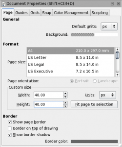
While you’re here, also make sure that snap to grid is enabled. I also recommend setting the snap distance to 10 pixels if its not set already, it’s located under the SNAP tab.
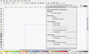
Now turn on your grid by going to VIEW > GRID or by pressing SHIFT + 3, and then enable snapping. (You could also use guides opposed to grids, but for beginners grids are a little easier to use.)
Start Drawing
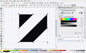
The quickest and easiest way to produce this technique is to draw the pattern by hand with the pen (or bezier) tool. Select this tool by pressing B. Start at the top left corner of the border (0, 40) and draw the top piece of the pattern. Your pen tool should be snapping to the grid and you should make the points of the triangle at (0, 40), (20, 40) and (20, 0). For now, don’t worry about the stroke and fill settings.
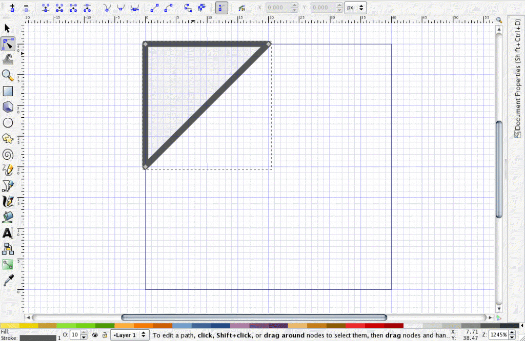
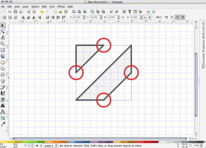
Now you will want to begin drawing the second part of the pattern. Again use the pen tool, and make sure your lining up to the intersections of the top stripe.
Combine Objects and Finish Up
Now we need to combine the two objects. Select both objects with the select tool (S) by clicking on each and holding down the SHIFT key. Now press CTRL + K or navigate to PATH > COMBINE. Now both stripes are part of the same object. With the object selected, open the fill and stroke dialogue box by going to OBJECT > FILL AND STROKE or press CTRL + SHIFT + F. Set the fill to black and remove the stroke by clicking the X box under the STROKE tab.
Exporting to Photoshop or GIMP
You’re finished with the pattern. From here you can export it as a PNG to use in Photoshop, another raster program, or use it as-is for a repeating background for a website. To export, navigate to FILE > EXPORT BITMAP or press CTRL + SHIFT + E and select the “export page” option and export bitmap.
Using the pattern in Inkscape
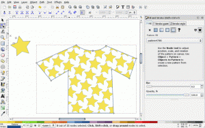
I know you’re excited to use this pattern we just created. Unfortunately, due to a bug in Inkscape some patterns don’t display how we’d like them to. However, this isn’t a problem if your pattern has white space around them. For example, if you just want to use a simple star pattern you can easily do the following:
1.) Create a star with the star tool.
2.) Select the star.
3.) Transform the star into a pattern by selecting OBJECT > PATTERN > OBJECT TO PATTERN or by pressing ALT + I.
4.) Apply the pattern to an object by selecting the object, opening the fill and stroke dialogue box, and select the pattern for the fill.
A basic drawing with a star pattern applied
The Inkscape pattern bug (affects verision .47 and below)
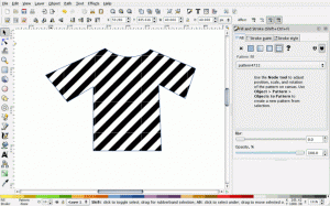
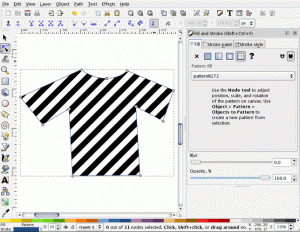
Trying the same technique with the pin stripe pattern, exposes some problems. Notice the white gaps below (you may need to click on the image to notice the gaps).
A Work Around
The best option I’ve discovered for getting around this problem is to use tiled clones in place of patterns.
1.) Select your pattern, and transform it back into an object by selecting OBJECT > PATTERN > PATTERN TO OBJECT or by pressing ALT + SHIFT I.
2.) With the object selected go to EDIT > CLONES > CREATE TILED CLONES. With Simple translation selected, enter your desired height and width or number of clones and select CREATE. You may still notice some slight gaps, but they will be fixed shortly.
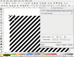
3.) Select all of your clones and then select EDIT > CLONES > UNLINK CLONE or SHIFT + ALT + D. (This is an important step, so don’t skip it.)
4.) Combine your pattern by selecting all of the stripes and pressing CTRL + K or selecting PATH > COMBINE. This will fix any remaining gaps.
If you just want to use this as a background image, you’re finished. However if you want to use this pattern to style an object you have one more step.
5.) Turn this new object into a pattern by selecting OBJECT > PATTERN > OBJECT TO PATTERN or by pressing ALT + I. Now you may apply this to whatever shape you would like, as long as your new object is smaller than your clone-created-pattern.
Download the SVG image here. To download right click on the link » save link as.

great tutorial!
awesome tutorial
alas, applying your clones-tip gaps get thinner, but still remain.
I’ve tested this several times with different patterns and haven’t had trouble with it. You need to make sure that you combine the clones to one another (after they’re unlinked). There will be gaps between the clones until you combine them.
Thank you for your reply. I think that I missed a step due to late hour, because i cant reproduce the results i had last night. Also part of the problem may have been because I’m trying to make multicolored patterns, so I might have needed more steps.
Well I apologize, as everything works fine now.
I also suggest not to make a pattern (perhaps large pattern mappings are too heavy for a pattern library) but simply to define a “cut” (i don’t know the English menu item term) with the desired object to paint). However, let’s pray all together to get rid of this very old and very annoying bug one day.
Even Better Work-around:
Those annoying whit spaces are actually just transperent spaces. So if you duplicate the object, change it’s stroke color to the main color of the pattern, and put it in the back of the z-level, it makes it look a lot nicer. Isn’t perfect and only works with patterns that have a dominant color on the border. Hard to explain, so I took a screenshot to help you understand:
http://i39.tinypic.com/30c99x0.png