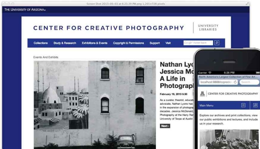
The Center for Creative Photography hosts photographic collections from some of North America’s most well known photographers—with works ranging from Ansel Adams to Edward Weston—it was a complicated project with a very unique set of requirements.
One of the primary goals of this project was to put the images front-and-center. The Center wanted to keep the site’s design focused on images and requested that there be little to no texture or extraneous elements to detract the viewer’s attention from the images. We ended up implementing a very minimal, flat design based on a 12 column grid.
The most interesting design feature of the site is that the background and link colors change based on the section of the site. The colors for each section are based on the University’s secondary color palette which were slightly modified to meet accessibility guidelines.
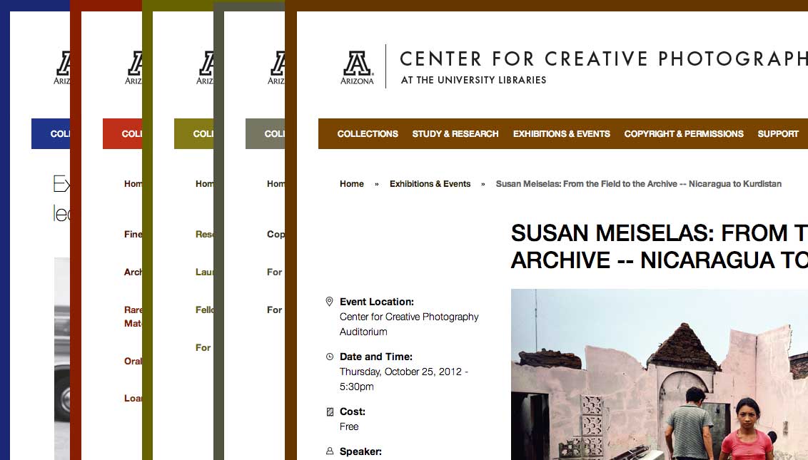
To make this system flexible we built a mixin with SASS that took in a color variable and generated the appropriate CSS to style the background, menubar, and link colors for each section.
The Library’s web development team chose to develop the site using a popular Drupal framework. Unfortunately this meant dealing with a lot of unnecessary markup and third party bugs. The framework also intentionally neglected older versions of Internet Explorer which we needed to support. This choice ended up adding a significant amount of time to the development process and introduced constraints to the site’s design and feature set.
Beside’s challenges with Drupal, there were many other aspects of the project that made it challenging. One was of these was creating responsive designs around tabular data.
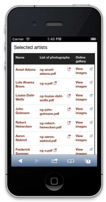
We ended up opting out of using an overflow-hidden approach and instead putting in the extra work to make sure the tabular data was fully scannable on mobile viewports, designing the tables so that they were easily usable on a 320px wide phone. At the time we deemed that signify a resource as a PDF was important because iOS and some other mobile platforms didn’t have the capability to download of view those types of documents.
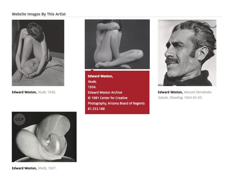
To make things more complicated each artist has their own requirements for attribution of work. We had clearly defined requirements from the start that images would only require artist name, work title, and date of creation. Unfortunately, this ended up not actually being the case and the requirement changed the day before the scheduled launch of the design—we needed to show all copyright data and meet the guidelines set by each individual artist.
Overall the project was a large success and we were able to reuse many of the same design patterns for the Special Collections redesign project to help maintain consistency between the Library’s web properties.