Stop Stealing Sheep & Find Out How Type Works

Spiekerman and Ginger provide a short, fun examination a ton of different type faces and how they might be best used.

The reader will learn that a typeface itself sends a message and can itself manipulate the meaning of text. How proper leading and measure can aid or hinder the reader depending on the kind of text meant to be consumed. Newspapers generally have short measure to aid a reader in being able quickly absorb the text, while a book or long form journal entry is more often set with a much wider measure to encourage long distance reading.

This is a fun, colorful book that provides good explanations of how different typefaces and type setting methods can impact a design.

Get on Amazon

Thoughts on Design

Originally published in 1946, the revised edition of Thoughts on Design is a short piece of work—less than 100 pages in total.

It’s littered with full page spreads of Rand’s work which he uses to illustrate what exactly his thought are on good design. Rand argues that designer doesn’t begin with some preconceived idea, but that the idea should be the result of research and observation, and the design of a product be the result of that idea. He touches on symbolism, humor, and how both geometric and abstract shapes can help create effective designs.

Get on Amazon

Design Is a Job

In addition to running a web design company that consistently puts out great work, Mike is also known for his hilarious “Fuck You, Pay Me” talk.

If you haven’t seen it yet, it’s worth your time. Like many titles in the A Book Apart series, this one seems like a conglomeration of blog posts fit into a nice, read-in-a-day format. Which if you’re anything like me (a designer short on time) — it’s a fantastic selling point.

This book takes you through the ins and outs of getting clients, presenting your work, and of course getting paid. I recommend this to anyone that’s either freelancing or running their own business in the service industry — even if their business happens to be outside the field of design. It’s funny and I think there are things to learn here if you’re just starting out or 10 years in.

Get on Amazon

The Shape of Design

The Shape of Design looks at conceptual relationships in the creative process. Analyzing the symbiotic relationships of questions such as how and why can help designers be better equipped to solve design problems.

Frank asks that designers dig deep and define purpose in their work, and encourages us to create work that we truly care about. He discusses how limitations can help define the design process, build momentum, and aid in improvisation and creativity.

An improvisational structure allows us to get to work, because we no longer need to know precisely where we are going — just choose a direction and trust momentum.

Although it’s a short read, there’s insights that should be applicable to designers in any field or level. It’s available online to read for free, but definitely a worthy addition for your bookshelf.

Get on Amazon

The Design of Everyday Things

If you ever run into a “UX agency” and they’re not familiar with Don Norman’s work, you might want to reconsider working with them.

He’s well known in the UX field for his research and publications about human—computer interaction, and is credited with coining the term “user experience”.

Intended to be “a starter kit for good design” this is a book written for an audience larger than just those in the design field. Learn about discoverability, understanding, and affordances in a discussion about everyday objects and how you can incorporate these concepts in your design process to create user friendly work.

Get on Amazon

The Elements of Typographic Style

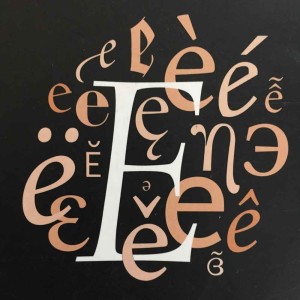
Probably the single most important aspect to becoming a good web designer is learning how typography works. Type dominates the web plays a supporting role in shaping a website’s character.

The Elements of Typographic style, written for typographers with a deep dive into the historical context of type, scale, and layout — is at its core a typographic style guide, but really so much more and contains highly valuable information for a web designer. Robert Bringhurst puts type into focus by explaining current best practices and how we’ve gotten there from a historical context. It’s not a light read and weighs in at 383 pages, however, a large section of is devoted to excerpts from specimen books and a glossary of type designers and foundries.

I found the discussion of page proportions as musical intervals to be one of the most interesting sections of the book, but there’s no shortage of ah-ha moments for the amount of knowledge that’s shared within these pages.

It’s also beautiful. I highly recommend it.

Get on Amazon